Premium in-app features
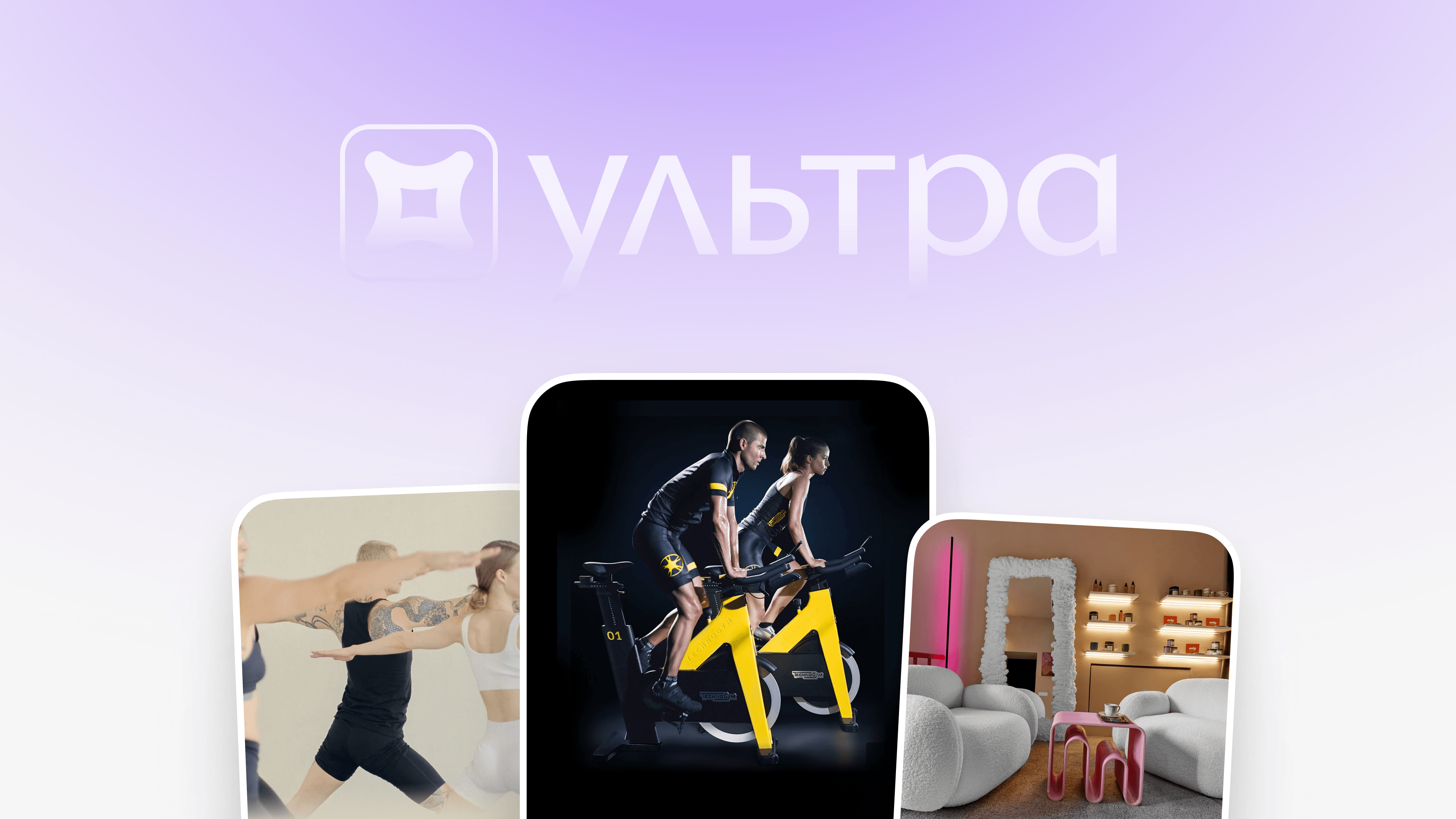
Fitmost Ultra for the most valuable users to make their experience even better
- 3 min read
Fitmost has always been a profitable, but not inexpensive service. Prices are set in points instead of regular currency, and the relatively high cost creates a strong entry barrier. This pricing model automatically evokes a feeling of exclusivity and premium quality — something we had never explicitly highlighted before. To be honest, the main communication focused on accessibility and convenience rather than status.
This became particularly important when the country’s largest banks (Sber and Tsifra) required the creation of a premium section in the app as a condition for including Fitmost as a VIP privilege for their loyal customers.
Soon after, I received a message from our CEO: “We need to make it cool! Users should feel the premium experience when they open the app.”
That was the starting point for developing the concept for a new product tier.
Concept and Goals

Parallel to this, I clarified with the product team what business outcomes we expected from the update — a +10% increase in ARPPU. Once the key metric was defined, I used an iterative approach: broke the project down into smaller tasks that could be distributed among the team. This is how work on Fitmost Ultra began.

Visual Direction
The main transformations were focused on the UI for locations and reservations, since these screens most directly shape user perception of value.
- The list of places became the visual centerpiece. To emphasize that ultra-places are special, I introduced 1:1 cover photos, each with an individual accent color derived automatically from the average tones of the image. Chat GPT suggests to add something like “This emphasized uniqueness and improved recognition by 20% in testing.” – we didn’t measure that this way because the impact of the new view is obvious
- The ultra-location screen now stands out through a dedicated background system and large imagery, complemented by the place’s custom svg logo.

The background for each ultra-location is generated dynamically, ensuring the card visually dominates other listings.

The content colors are also calculated automatically to maintain contrast and readability. This allowed consistency across thousands of photos without manual art direction.

Ultra users can switch between regular and Ultra modes of the app — changing not just the visuals (locations, class cards, splash screen, app icon), but also unlocking a filter for Ultra-only places. This reinforces a sense of belonging to an exclusive tier achieved through activity rather than money.


Results
- Fitmost became a partner in the loyalty programs of several major Russian banks. This expanded our premium user base.
- ARPPU did not show statistical significance across the entire cohort, but notable uplift appeared within the Ultra-user segment.